A futures spread chart is not an outright price chart. It shows the difference between two contract legs according to a defined formula. That means the trend represents relative strength, not necessarily the direction of the commodity itself.
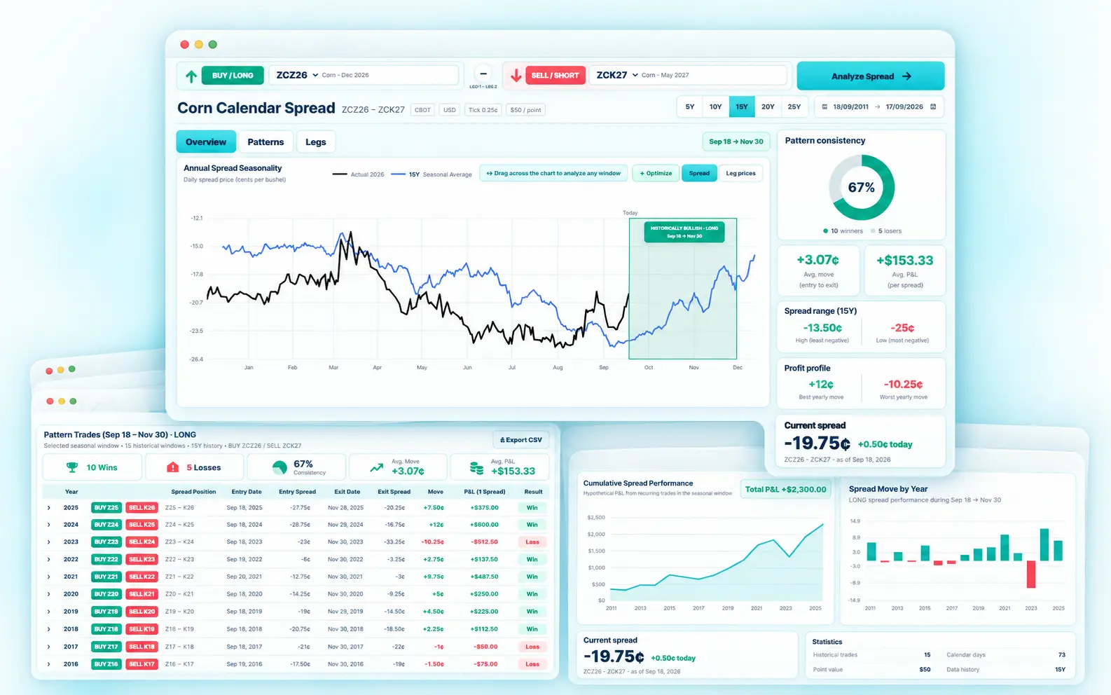
Positive and negative spread values
The sign is a result of the formula. A negative spread is not automatically bearish, and a positive spread is not automatically bullish.
Add a seasonal overlay
A historical seasonal average shows how the same relationship behaved at similar times in prior years. The individual years are still essential because the average can hide dispersion.
Use the live Futures Spread research workflow
Select exact Corn contracts, compare historical windows, inspect every season and connect the result with the current curve.
Start AnalyzingUse the chart to define a research window
Drag across a date range or define entry and exit dates, then recalculate the historical outcomes for that window. This turns a visual pattern into a measurable hypothesis.
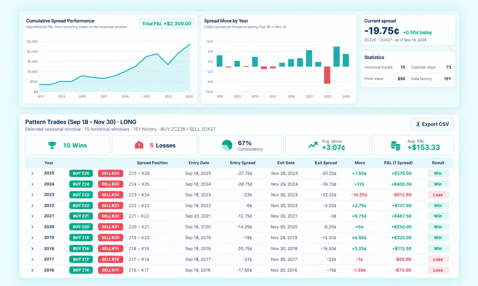
What a good spread chart should show
- Exact contract symbols.
- Clear leg order.
- Current spread and historical average.
- Selectable history windows.
- Access to individual historical seasons.
What the chart should reveal beyond direction
A good spread chart should help you see acceleration, flattening, regime changes and how the current path differs from the historical average. The most useful information is often where the current line diverges from the seasonal line, not where they overlap.
That divergence can indicate that the current year is behaving unusually. It does not automatically create a trading signal, but it tells you the historical template may be less representative.
How to compare the current year with history
Look at the same calendar dates, but also check the starting spread level and curve structure. Two years can share a similar seasonal path while beginning from very different contango or backwardation regimes.
Use the chart as a gateway to the underlying years. If the average looks strong, inspect whether the historical paths were genuinely similar or simply converged by chance.
Explore this tools cluster
Frequently asked questions
Is Futures Spread free to use?
The site provides direct access to the research interface and current Corn spread tools. Pricing and access terms can change, so use the live product pages for the current offering.
Which market does the live analyzer support?
The current live research workflow is focused on Corn dated futures contracts and Corn calendar spreads.
Does the tool give trading signals?
No. It provides historical seasonality, spread relationships, rankings and curve context for research. Historical patterns are not forecasts.
Why use dated contracts instead of a continuous futures chart?
Calendar spreads depend on exact delivery months. Dated contracts preserve the specific relationship being researched.
Move from a spread idea to transparent historical evidence
Use the live analyzer, screener and forward-curve tools to research Corn calendar spreads.
Open Futures SpreadFutures trading involves substantial risk. Futures Spread is a research and education tool. Historical patterns, rankings and backtests do not guarantee future results.